Evaluate model
In the evaluation view a user can find model performance KPIs and robust interpretability of your developed ML model to explain modeling results in a human-readable format. Evispot ML platform employs a host of different techniques and methodologies for interpreting and explaining the results of its models. A number of charts are generated automatically including Shapley, Variable importance, Decision Tree Surrogate, Sensitivity analysis and more. The first view you will see is the model results.
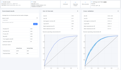
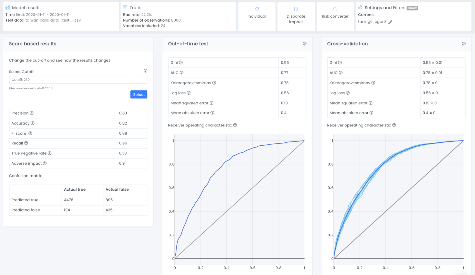
We have previously looked into the gini mean (also referred as cross-validation) and gini OOT. As can be seen in the plot they are very similar which means that the model is robust and the likelihood that this model would perform with similar results on live data is high. In this tutorial we will also go through the score distribution and the score based results, particularly the confusion matrix. If you are interested in the other KPIs such as AUC, Kolmogorov-smirnov and more, I recommend you to read more about these in our documentation.
Score based results
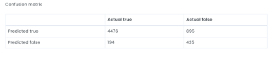
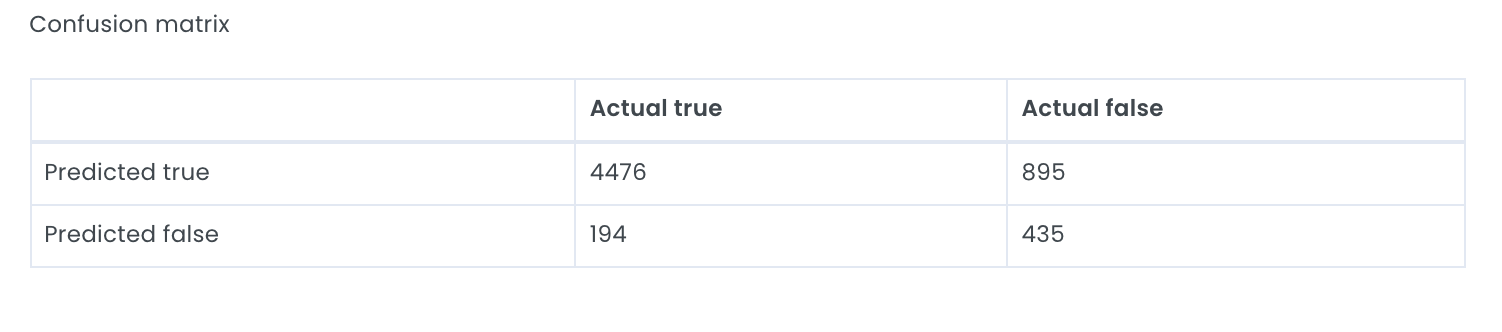
All metrics that are shown here are calculated from the confusion matrix which helps to illustrate what kinds of errors a model is making. To create a confusion matrix we need to decide upon a cutoff, the Evispot ML platform will as default choose the maximized f1 score, but the cutoff can be changed by selecting another cutoff. The reason the maximized F1 score is chosen as default is because it is a very good metric to use when your dataset is skewed, meaning that one class has much more observations than the other. In this case, the default rate is ~22% meaning that most loan applicants pay back their loan, hence a skewed dataset and F1 score is the recommended metric to use. However it is possible to change the cutoff score. In this tutorial we will use the default cutoff and if we take a closer look at the provided confusion matrix, we can see that the model predicted:
- 4476 loan applications were predicted as not defaulting and DID not default
- 895 loan applications were predicted as not defaulting when in actuality they defaulted
- 194 loan applications were predicted defaulting when in actuality they DID not default
- 435 loan applications were predicted defaulting and defaulted in actuality
For this self-paced course we will simplify the calculation of how much money we are missing out in form of interest and how much money we are losing in defaults.
The 194 cases of loan applications that the model predicted default and was rejected, but would have been paid can be translated to a loss in potential income of (194 * average amount * interest).
The 895 cases of loan applications that the model predicted should be granted a credit card because they were predicted to be non-default can be translated to losses of (895 * amount).
If this model were used to determine credit card approvals, the lender would need to consider the 895 misclassified loans that got approved and shouldn’t have. Also 194 loans that were not approved since they were classified as defaulting.
Tips
One way to look at these results is to ask the question: Is missing out on approximately 194 loans that were not approved better than losing about 895 loans that were approved and then defaulted? There is no definite answer to this question, and the answer depends on the risk strategy a bank is willing to take.
These calculations are very simplified, to make a more detailed profit/loss calculation, we recommend looking into the risk converter which is a tool where you can test and try different interest rates and other costs related to your business to get a more precise estimation of your profit loss calculation.
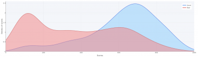
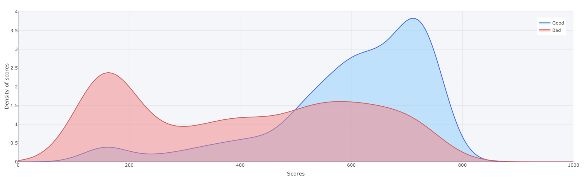
Score distribution
The score distribution plot shows the density of scores splitted by the target classes (in this case defaulted or non-defaulted). The blue distribution represents the density of the non-defaulted applications while the red represents the defaulted applications. The objective with the plot is to visually illustrate the model’s ability to differentiate between defaulted or non-defaulted applications..
The x-axis shows the model score, which will be a value between 0 and 1000. The y-axis shows the density of scores.
If looking at the score distribution from our case it is possible to see that most defaulted applications are do have a score around 200 and most non-defaulted applications do have a score around 750.

Tips
When looking at the score distribution plot, it shows if the model is able to distinguish defaulted loan applications vs non-defaulted loan applications. This is accomplished if the blue line´s density is high near 1000 and the red line´s density is high near 0, as the above plot shows. Another thing to look into is how smooth the two lines are. We can see that the blue top does have a small hack around 620, which we preferably would not want. There could be many different reasons for this, one could be that there is a one or two variable with very high importance, so the model will say that everything above a certain variable value will be stated as a good loan. Another reason would be that we don’t have that much data. In this case let’s explore the variables to further dig into the model.
Next step would be to go to view Traits including information about all the variables that the model has used.
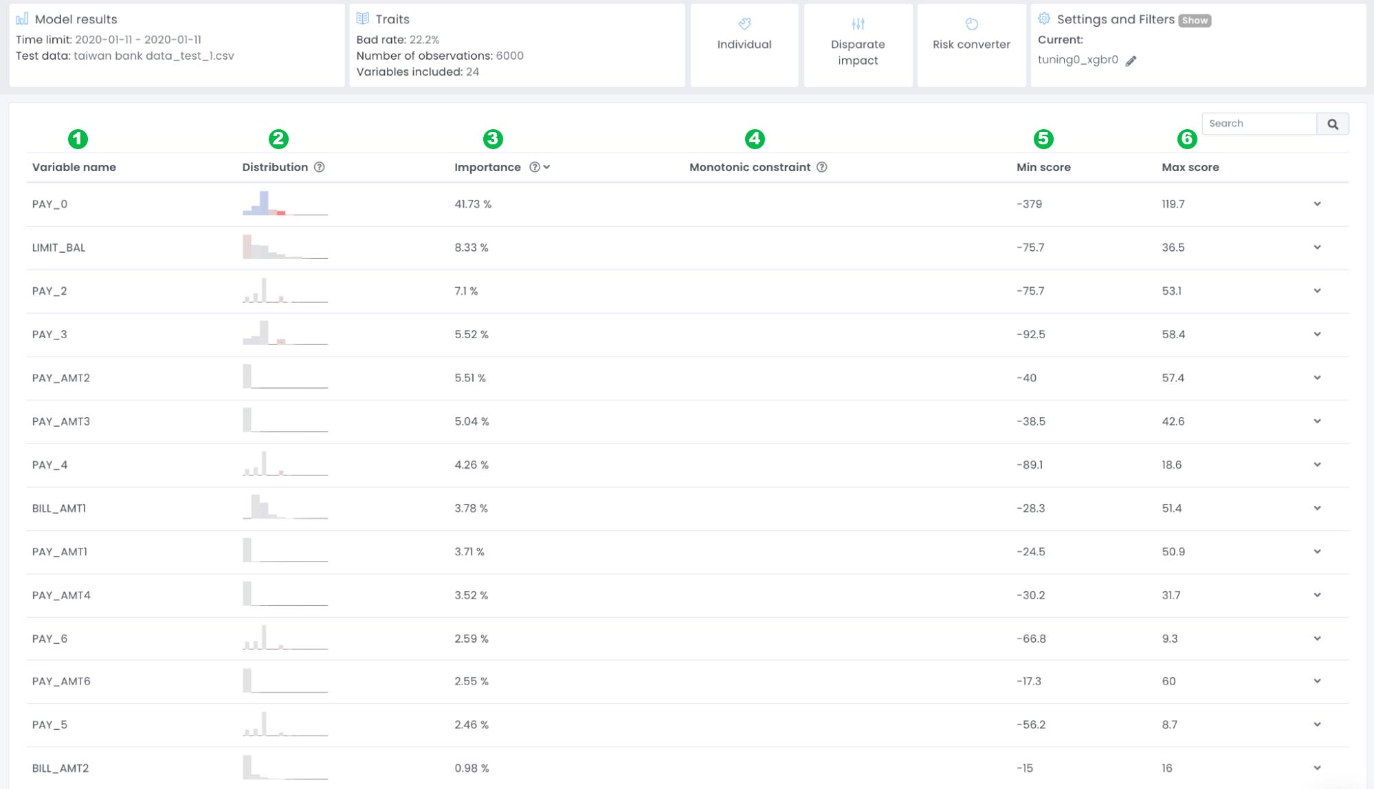
Traits
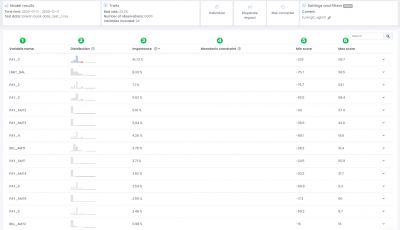
1: Variable name: The name of the variable
2: Distribution: Distribution plot of the variable
3: Importance: The average importance of the variable.
4: Monotonic constraint: If a monotonic constraint has been set to a variable, empty if not set.
5: Min score: The minimum point this variable has contributed to one application of the test dataset
6: Max score: The maximum point this variable has contributed to one application of the test dataset
Tips
The goal with this view is to give you an understanding of which variables that are used in the model and which variables that are most important. There are no rights or wrongs here, but it is good to use common sense and go through if all variables make sense. In this example we can see that the variable PAY_0 has an average contribution of ~41% of the decision, meaning this variable has a very high impact on the final model prediction. If we want to look closer into the variable PAY_0 we can expand the row by clicking on the arrow to the right. The first plot to look into is the variable analysis plot:
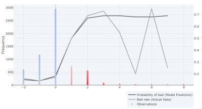
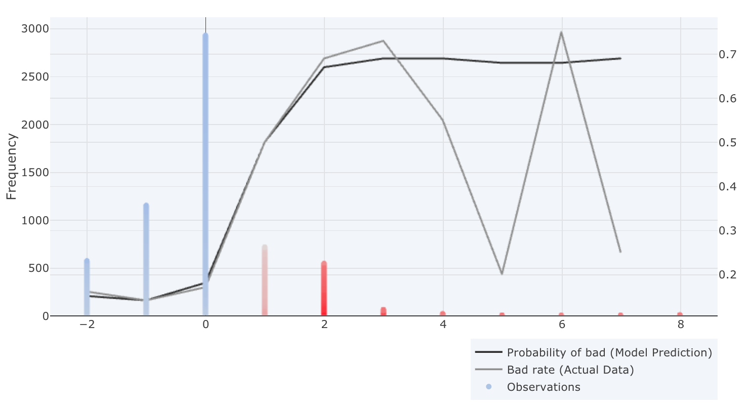
Variable analysis
When expanding the variable PAY_0, you expand it by clicking on the arrow placed on the right side of the variable row, the variable analysis plot will appear
X-axis: Represents the value of PAY_0, and in this example we can see that there exist values between -2 – 8, meaning that there exist borrowers that are 2 months early to 8 months late with payment.
Left y-axis: Represents the number of variable observations (Frequency) for PAY_0 and we can see that the majority of the applicants are not late with payment, (e.g value of 0).
Color of observations: Represents a color scale from red – grey – blue, where red has a negative effect on the score (high risk) grey has no effect on the score and blue has a positive effect on the score (low risk).
Right Y-axis: Represent a number between 0 – 1, illustrating the probability of an event occurring. In this case it will represent the default rate.
Colour of lines (Right Axis): The black line represents the model’s prediction probability of bad. The grey line represents the default rate in the actual data.
Tips
The purpose with the traits view is to give you an overview of which variables are most important and trends of variables, to make sure that we can trust the model before it goes live. If we look into the most important variable PAY_0 it we can see that there is a higher risk of default if a borrower was late with the latest payment compared to if the borrower paid in time.
It is also important to look closer at the black (model prediction default rate) and grey line (actual data default rate). We want these lines to follow each other, however it might be a good thing if they differ if very few observations are found in a specific area. If you look at the plot above, we can see that the grey line (default rate of the actual data) drops to 20% if you are 5 months late with a payment, while the default rate is around 70% if you are 4 or 6 months late.
We can also see that very few loan applications can be found when PAY_0 is equal to 5. This means that the model will say it is equally bad if a person is 4, 5 or 6 months late with a payment. To verify this we can also have a look at the partial dependence plot. The partial dependence is a measure of the average model prediction with respect to an input variable.
Partial dependence
X-axis: Represent the variable value we chose to analyze
Y-axis: Represent the Evispot score.
The plot below is the partial dependence plot of variable PAY_0 and here we can see that if all other variables are the same, the model prediction will go from a score of 600 to 230 if PAY_0 would differ from 2 to 0. Thereafter we can see that it is around 230 regardless if you are 2 months late or 8 months late.
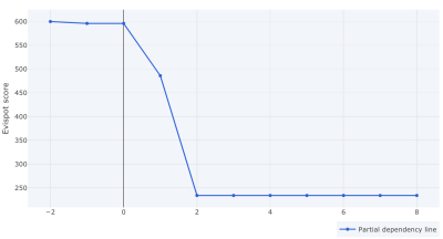
In this case, even if PAY_0 represents if the last payment was paid in time or delayed, and should have a high predictive power, over 40% is a lot, and if we remember that the score distribution plot did have a hack around 620, our would suggest to retrain the model with higher optimization depth to see if we can smoothen out the distribution plot and if other variables might gain higher importance on the final decision.
Result after retraining model
After retraining the model with higher optimization depth, we can see that we were able to increase gini score 0.03 in OOT, we can see that the variable PAY_0 importance decreased from 40% to 30% and other variables have got more importance in the decision. Lastly we can see that the score distribution looks much smoother.
Other things to explore
- Individual – to see individual loan application and how much each variable impact a decision
- Disparate impact analysis – a statistical framework to understand if the model is biased towards any protected groups
- Decision tree surrogate model – The decision tree surrogate increases the transparency of the AI model by displaying an approximate flow-chart of the complex decision making process.
- Risk converter – A framework to do profit/loss calculations
- Segmenting and filtering the test data – Dig deeper into subgroups of your data
Model summary and auto-report
To emphasize, Evispot ML platform allows you to download an auto-generated Model report including the following sections:
Project Overview: Summary of the project including information about the model score and data that was uploaded.
Original Data overview: Detailed description of all the variables that was uploaded to the software
Process overview: Text describing what has been done in this project
Model variables: Description of which variables that has been selected for the final model
Final Model: KPIs and information about the model that has been chosen
Risk Converter: Profit/loss calculations (only including if a risk converter has been created)
Appendix: Including plots and graphs about the variables and model performance
Tips
The autodoc is the auto-generated paper you can show to all stakeholders in the company and external regulators.
Next steps:
Before we conclude this self-paced course, note that we haven’t focused on the fifth step of our Evispot ML workflow: deployment. Given the complexity of the step, it will be covered in another self-paced tutorial.
We exist to ensure that decisions are given in an accurate, transparent, ethical & fair manner.
